Petrucci bio on Wikipedia
What's inspiring about Petrucci the man is his courage to innovate as well as act to protect the process of innovating, since it was available to him.
More later.
Wednesday, January 18
Petrucci, Ottaviano (1466-1539)
When Finale was introduced two decades ago, it used Petrucci as its music font, and recently this piece of work was elevated to emeritus status: it's now considered a legacy font.
Good.
Stands to reason, the original Finale designers wanted to watermark any and all of their product's output. Hence:

By now everybody recognizes the familiar treble clef. It tagged anybody's work as Finale immediately.
Before continuing, let's check out a small gallery of other font setups:
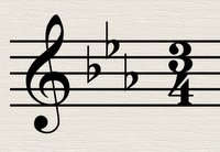
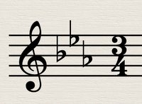
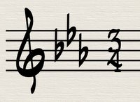
Now until Maestro, Engraver, and Jazz were supplied with Finale, you tried rolling your own music font or used Adobe's Sonata, if you knew Petrucci wasn't a publisher's cup of tea. Petrucci was Coda's way of saying that the software was more important than the work you accomplished with it.
I suppose that nowadays Sibelius is a way of telling MakeMusic that Finale is only a conduit for creation/realization, and must not call attention to itself in the final output. It can only call attention to itself within the user experience while doing the work.
Put another way, when you are reading and playing a Beethoven sonata, the publisher and engraver and technology must be invisible, and only Beethoven must be visible. How is this accomplished?
Later . . .
Oh, you were wondering about Petrucci, weren't you? The man, that is.
next . . .
Good.
Stands to reason, the original Finale designers wanted to watermark any and all of their product's output. Hence:

By now everybody recognizes the familiar treble clef. It tagged anybody's work as Finale immediately.
Before continuing, let's check out a small gallery of other font setups:


Now until Maestro, Engraver, and Jazz were supplied with Finale, you tried rolling your own music font or used Adobe's Sonata, if you knew Petrucci wasn't a publisher's cup of tea. Petrucci was Coda's way of saying that the software was more important than the work you accomplished with it.
I suppose that nowadays Sibelius is a way of telling MakeMusic that Finale is only a conduit for creation/realization, and must not call attention to itself in the final output. It can only call attention to itself within the user experience while doing the work.
Put another way, when you are reading and playing a Beethoven sonata, the publisher and engraver and technology must be invisible, and only Beethoven must be visible. How is this accomplished?
Later . . .
Oh, you were wondering about Petrucci, weren't you? The man, that is.
next . . .
Tuesday, January 17
Looking for Work
Can a music prep guy restart, er, jumpstart, his career with a blog? Perhaps by providing a new mousetrap, a path will be beaten to his door. Read on.
Going back to the mid 80s I've been a copyist, music librarian, and after a while the staff orchestrator/arranger, for "MUSIC AT KINGSBOROUGH", a successful year-round program of events at Kingsborough Community College in beautiful Manhattan Beach, Brooklyn. That enterprise was recently terminated by a new administration. In any case I've used that experience to continually develop as a preparer of music notation, and perhaps I'm ready to take on a new persona.
Here's a question: which notation looks the most inviting, saying "play me"?
A: (it's just a png so it's not scalable, but you can view the graphic at full size in a new window)

or B: (same here)

If your answer is B, even though you might not even read music, what did you notice?
When I showed this to my wife just now, she first noticed that the notation in B is "bigger". To a certain extent this is an optical illusion because the dimensions of the graphic are the same, but it's the size of the objects in the notation that make the necessary impact, even in this small web graphic.
On to the next post. . .
Going back to the mid 80s I've been a copyist, music librarian, and after a while the staff orchestrator/arranger, for "MUSIC AT KINGSBOROUGH", a successful year-round program of events at Kingsborough Community College in beautiful Manhattan Beach, Brooklyn. That enterprise was recently terminated by a new administration. In any case I've used that experience to continually develop as a preparer of music notation, and perhaps I'm ready to take on a new persona.
Here's a question: which notation looks the most inviting, saying "play me"?
A: (it's just a png so it's not scalable, but you can view the graphic at full size in a new window)

or B: (same here)

If your answer is B, even though you might not even read music, what did you notice?
When I showed this to my wife just now, she first noticed that the notation in B is "bigger". To a certain extent this is an optical illusion because the dimensions of the graphic are the same, but it's the size of the objects in the notation that make the necessary impact, even in this small web graphic.
On to the next post. . .
Subscribe to:
Comments (Atom)